Hebrew Alphabet Stitch Charts
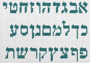
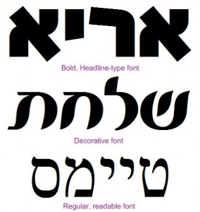
Judaica Needlepoint has made available a selection of my Hebrew Alphabet Stitch Charts at their website. There are twelve different typefaces to choose from, and each one comes in a range of sizes. Everyone should be able to find a font that works for their design. Best of all, these come in downloadable PDF files, which you can print on your home printer on regular letter paper. Even better than that: all of the charts are absolutely free.
You can click on the thumbnail images at the Judaica Needlepoint page to see a full preview of one page of the chart.
Each file includes a cover page with brief instructions for how to use the chart. This blog post expands on those instructions in detail.
Cross Stitch Charts for Needlepoint People
Cross stitch practitioners are the usual consumers of stitching charts. Needlepoint artists generally use pre-painted canvas, so counting stitches isn’t needed. However, once the needlepointer deviates from the painted design, for example when customizing a canvas with one’s own text, stitch counting becomes necessary to fit the lettering into the available space. Using an alphabet chart may seem a bit daunting at first, but it is easier than you think.
 Choosing a Typeface
Personal taste is the main factor when choosing a typeface for stitching into your canvas. Nevertheless, there are some other considerations as well.
If the text you are stitching dominates the design, you will aim for boldness. Decorative fonts will work well, such as those used in headlines or call-outs. Outlining and shading also will add appeal in this scenario.
If your text is subordinate to the main design, select a lighter, more delicate typeface which doesn’t distract attention.
If your text is an important element of the design, and is intended to be read, use a clear, delineated typeface that is easy to read. Also select colors for the typeface and the background that contrast with each other.
If your text is short, and not important to the design, such as the artist’s signature or a date, you needn’t worry about readability.
With Hebrew, you do not need to concern yourself with upper-case vs. lower-case. All letters are the same case.
Choosing a Size
Once you’ve settled on a typeface, you now need to select a font within that typeface. Every typeface comes with several sizes to choose from.
Larger font sizes allow for stitching more detail and the letters look much better. However, you need to choose a font your design can accommodate. If you choose a size too large, your message will be cut off.
 Measure Twice, Stitch Once
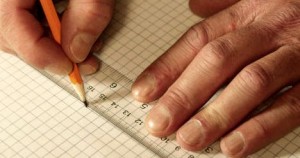
Here’s where stitch counting comes in. You need to prepare a worksheet to assist you with measuring your text within your design. Graph paper is very good for this purpose. If you don’t have any, search the Internet for PDF files you can use to print graph paper onto regular blank printer paper (example).
Locate the blank area in your design where you’ll be stitching your message. Count the number of stitches in width and in length. Now use a pencil to trace that area out onto the graph paper. Note that this might not be a perfect rectangle, the sides of the area may be irregular due to the surrounding imagery.
Start with a font that seems likely to fit. Trace out the letters on the graph paper, leaving one or two stitches between letters, and a little more between words. This can be adjusted later if you need to trim it down a bit. You may want to leave a stitch or two along the sides as a margin to set off the text from the rest of the design.
If your text occupies more than one line, you need to ensure that it fits vertically, too. The space between lines depends on the position of the ascenders and descenders of the letters (the letters that extrude higher or lower than the rest of the alphabet). You need to make sure that these letters don’t interfere with one another. The only way to work this out is to trace the letters out onto your worksheet and see what happens.
The main thing is to be consistent. Make sure there are an equal number of squares between the baselines of each line of text. The baseline is the row of squares which most letters rest upon.
Stitch Away!
Once you’ve successfully plotted out how you will fit your letters onto your canvas, you’re ready to stitch them in. You can simply stitch the canvas directly from the chart, but to make things easier, you might choose to first mark out the stitching using a cloth marker. This allows for corrections that do not involve ripping thread.
After you’ve stitched the letters, fill in the background with any contrasting stitch. Stay away from overly-complex stitches, you’ll be doing a lot of compensation due to the irregular edges of the letter forms. Make sure you use a background color that contrasts well with the color you used for the lettering; otherwise, it will be difficult to read.
